Apr 122024
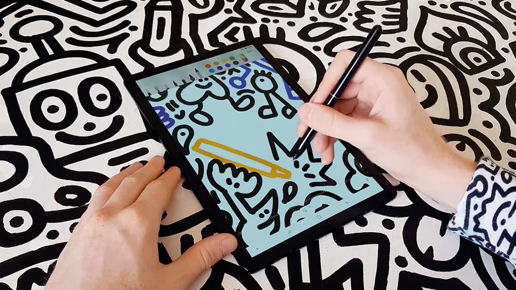
The artist fills us in on her daily spree of creative endeavours, from painting to creating cosplay costumes.

While Apple offers its premium tablet – the iPad Pro – in a couple of sizes and a variety of colours, Samsung is keeping things simple with this new, similarly priced device. The just comes in one size, a 10.5-inch display, and you can choose between an austere grey or a glossy black body that’s so impenetrable you could almost use it to recreate the monolith scene from 2001: A Space Odyssey.
So what's it like to draw and paint with? The answer for the Tab S4 is 'very good indeed'. The sensation of drawing is sublime, with just the right balance of smoothness and bite on the display.
The S Pen (which is included in the price, unlike the iPad Pro’s Apple Pencil) features 4,096 levels of pressure sensitivity, and feels responsive as you sketch, moving from the lightest of strokes to heavy mark-making without a glitch.
A discrete clip on the pen prevents the stylus from rolling when you set it down: a thoughtful touch. The pen also features a single shortcut button that’s so inset that it’s hard to locate it by touch – an annoyance if you tend to rotate your pen in your fingers as you draw.
The S Pen includes a discreet clip to stop it rolling away
Sadly, the minimalist feel of the device design isn’t reflected in the Android operating system driving the Tab S4. It seems to get busier with each release, with a lengthy setup sequence offering piles of settings and optional software downloads, and early use interrupting your activity with tips and advice.
The feeling of busyness isn’t helped by the new DeX mode, which presents an alternative interface more reminiscent of Windows running on a laptop. You can get an optional keyboard cover to clip on to your Tab S4 to complete the laptop transition.
As might be expected from the first try, DeX on the Tab S4 doesn’t really compare with Microsoft’s Surface running Windows 10, which offers a far more sophisticated pairing of desktop and tablet interfaces. Right now Samsung’s Tab S4 is better at being a tablet than it is a laptop. And while the display is bright and colourful, its narrow 16:10 ratio won’t suit every artist.
But these are minor quibbles against one of the best tablet-based drawing experiences you can find – and the inclusion of the S Pen in the package when so many rivals charge you extra makes the Galaxy Tab S4 a compelling option for creating art on the move.
This article was originally published in ImagineFX magazine (subscribe here). Read more: 80 awesome Adobe Illustrator tutorials.
Here’s what everyone has been waiting for: Corel Painter 2019 is here. It has long been a leading option in digital art software, but a renewed focus on performance and usability helps keep Painter 2019 ahead of the pack.
The expanded Brushes options includes new Pattern Pens, which produce strokes that make use of five new patterns. These can be based on an existing pattern library, but you can also create your own – essential when making original concept art. Elsewhere, the updated and enhanced version of the Real Watercolor wet brushes are able to realistically interact with your chosen paper’s texture and grain. Your colours will flow, mix and be absorbed by the paper, making your art look more natural than ever.
Opener artwork by Stefano Pistonatto
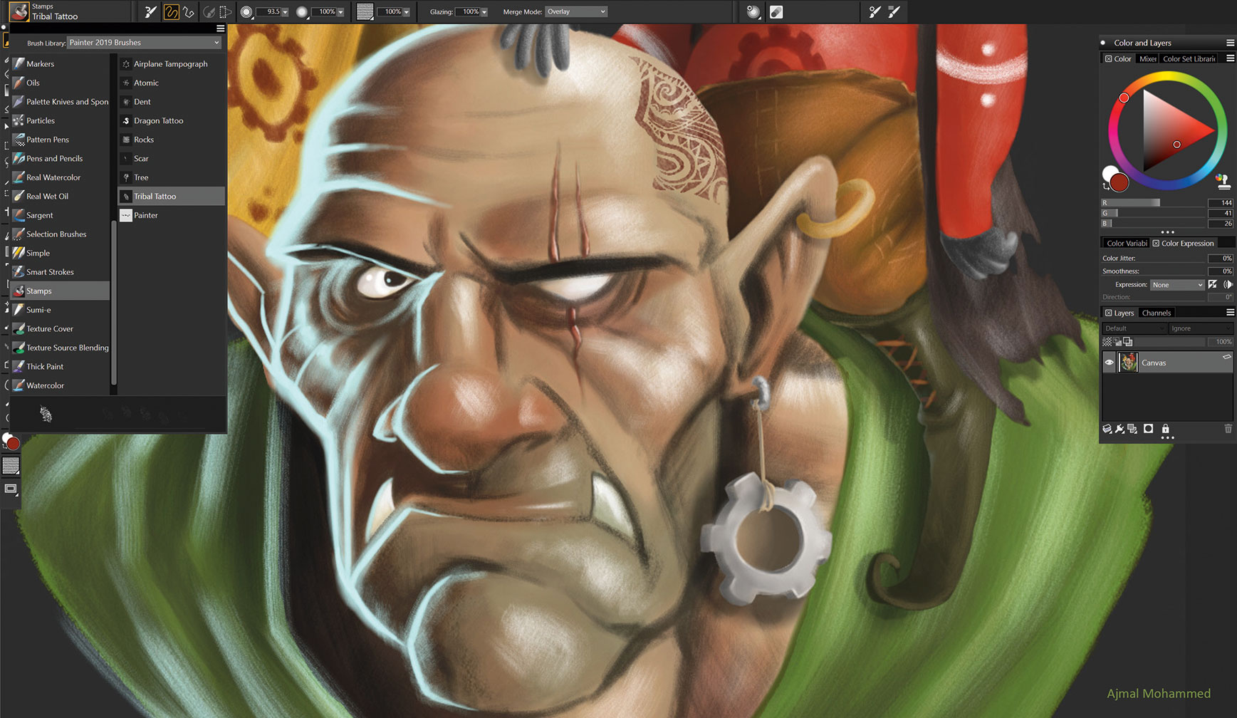
The new stamps brushes will certainly make an impact (artwork by Ajmal Mohammed)
Another update is the Color Selection tool. The colour choices are clearer and you can pin the Temporal Color Selector wherever you need it on your in-progress artwork, and use shortcuts to take samples with the Eyedropper. This is handy, especially when creating complex illustrations.
The program’s interface has also been revamped. Its darker tone makes it possible to see colours more clearly, and also helps you to focus on the canvas when painting – particularly useful when illustrating dark objects. However, if you miss the old grey interface, you can easily change it back.
Previous versions of Painter had a cluttered interface. Corel must have been listening to feedback from its customers, because version 2019 now features over 650 redesigned icons that bring a welcome simplicity to the workspace. This clean and responsive environment makes Painter 2019 easier to understand for newcomers, while seasoned users will benefit from a more efficient painting experience.
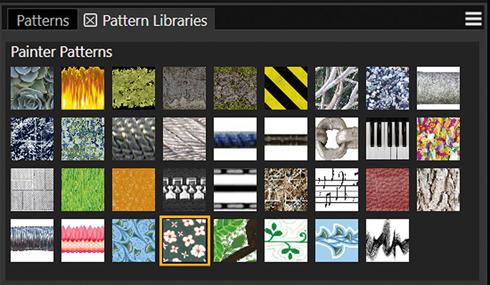
An updated and enhanced Pattern library offers more creative opportunities
The key update of Painter 2019 is the improvement in the application’s performance. Previously, the program had a reputation for running slowly on older machines. This is certainly not the case with the new version. Corel is to be congratulated for eliminating many speed bumps while retaining the feeling of painting traditionally.
For example, one of the problems with the old version was the noticeable lag that occurred when using the brushes, but now the brush engine works as smoothly as silk. There are still some little quirks – sometimes it slows up on multi-touch operations, and there are a few bugs that need to be addressed – but overall the program has come on a long way since version 2018. What a difference a year makes…
We think that Painter is still the leading traditional media painting program, and the improvements make it look even more appealing. Yes, there are cheaper alternatives such as Rebelle 3 and ArtRage 5, but neither program has the painting power that Painter wields.
This article originally appeared in ImagineFX magazine. Buy issue 166 or subscribe.
Read more: The best free design software.
Savage Interactive released Procreate Pocket at the end of 2014. The iPhone version of Procreate was well received, with users making the most of the app’s 12 default brushes to paint on the go.
In the years since, artists have come to expect more from their creative apps, and so the developers have stepped up to the plate with Procreate Pocket 2 , which, with its freshly written underlying code, may as well be a brand new paint app.
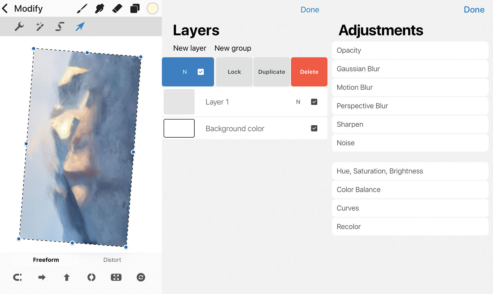
The Modify, Layers, and Adjustments dialogs are just a quick tap and a swipe away
When it’s launched, you’re presented with a screen asking if you want to select a canvas from displayed examples, use a user-created one, import an existing image, open a photo, or create a new canvas. New canvases can be created in various sizes up to a whopping 8K resolution.
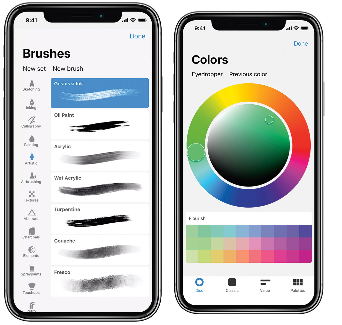
Procreate Pocket 2 has a clean and minimally invasive interface that makes the most of the ’s larger screen, although it works well on smaller iPhone models, too. Basic tools are located at the top of the screen including a drop-down Modify menu. Two small tabs on the left control your brush’s size and opacity level.
The Modify menu items enables you to make changes to either the app or your image. The spanner icon opens the Actions menu where you alter how the app behaves, while the wand icon brings up the Adjustments menu. Here, art tweaks can be applied to layers or complete images. The 'S' icon brings up the Selection menu, and the Arrow icon accesses transforming tools.
There are various brushes to choose (left), plus four different methods of selecting colours (right)
To start painting, select the brush on the top menu. You’re presented with multiple drawing and painting tools that are arranged in 17 individual sets. Each set comprises multiple brushes – there are now 136 to choose from in the app – and brushes can be customised and saved. With a brush chosen, select a colour using the far right circle icon.
There are four ways of choosing colours, and colour palettes can be imported, too. Click the Layers icon to see all the image’s layers. You can add or turn on and off a layer’s visibility, create new layers, group layers and change blending modes.
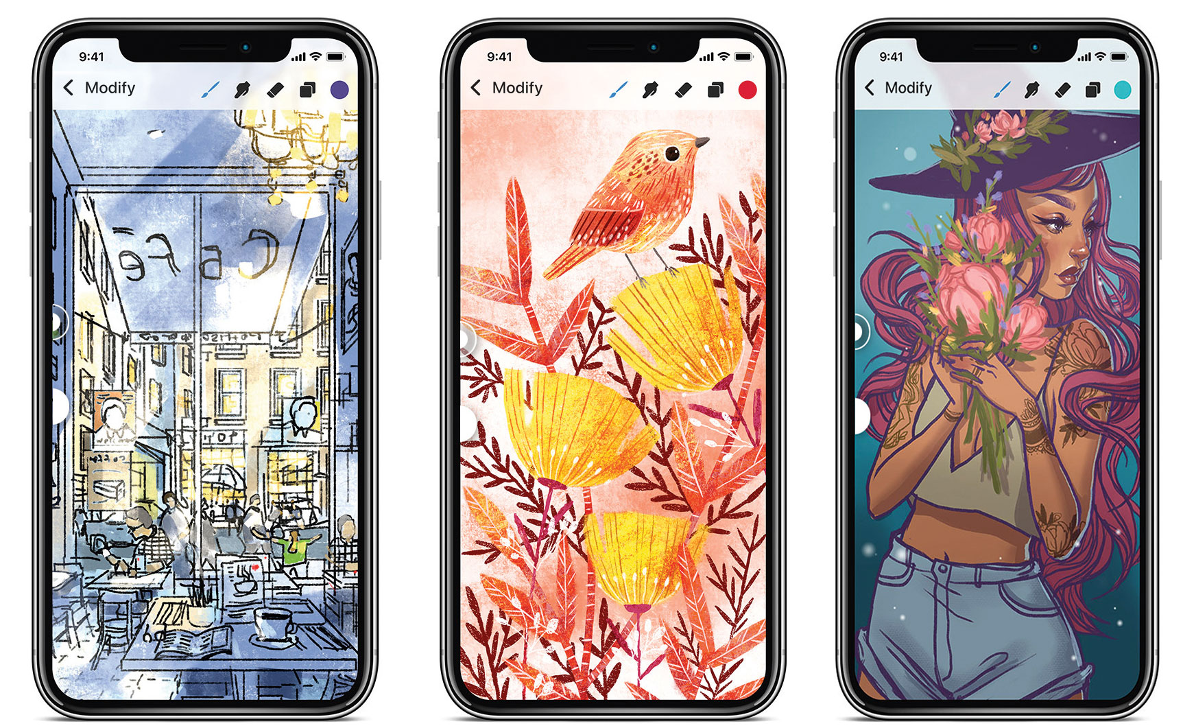
Incredible artwork is at your fingertips with Procreate Pocket 2
Ready to start painting? With so many options the number of choices can seem overwhelming but really, you can start by picking a brush, a colour, and then just start getting creative.
The app contains many more advanced features, such as 64-bit colour, continuous auto-save, 250 undo levels, and recording your work in 30-second bursts for sharing online. Overall, a product of this maturity and quality is a rare thing. Artists who own an iPhone should make Procreate Pocket 2 their app of choice, and this app also works on iPad and iPod touch.
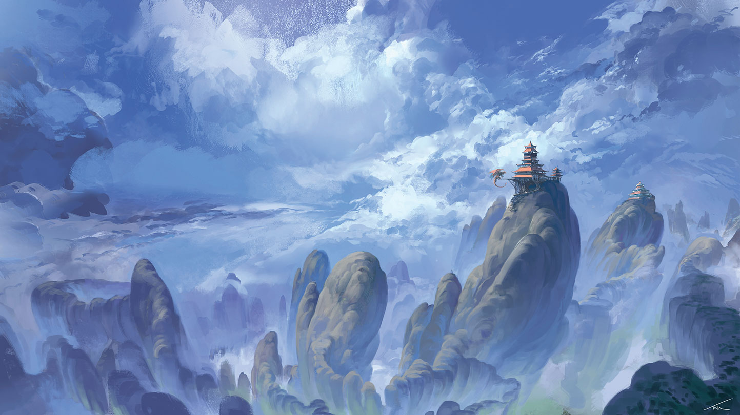
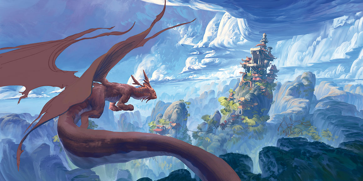
I created my original painting around this time last year, having been inspired by the vast fantasy landscapes by artists like Dongbiao Lu and Ruxing Gao. It was my first stylised environment artwork.
A year later I was interested to see how I could improve the piece. There was something very successful about it that was most likely a happy accident at the time, but had continued to evade my understanding until now.
Looking back at it, I started to notice errors in the art techniques used, including the lighting, design work, composition and shape design. My challenge was to try and preserve what had worked then, while fixing the composition to make a better painting.
Reworking the image involves emulating a fish-eye lens
The lighting in the original scene is inconsistent, which makes it difficult to understand how the objects occupy the space they’re in. This is particularly noticeable on the mountains and so I start to paint over these first. I choose a light source – the sun coming from the top left – and some rough camera settings. To encapsulate the expanse of the environment, I attempt to emulate a fish-eye lens effect by having the base of the mountains converge at the bottom and then adding a slight curve to their trajectory upwards.
Elements such as clouds can have a dramatic effect on a painting
The clouds follow a curve that helps convey their scale and position. I keep the shape design consistent with the mountain range because it creates an interesting repetition between the ground and sky. I then redesign the monastery as a stylised dragon’s head, which fits the whimsical fantasy mood I’m trying to achieve.
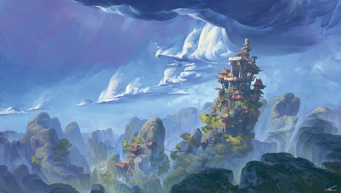
Simplifying clouds into large, rounded forms is great for selling their scale, but it starts to make them appear like solid, hard-surfaced objects. To bring back the softer feel I break up the hard edges with smooth gradients and smaller brush strokes, some of them overlapping to indicate translucency. This finer detailing was also present in the original and explains a lot of why it remains a decent image, despite some technical flaws.
I want to keep the focus on the environment, so I paint the characters with an almost graphical approach. The folds in their clothing are represented with flat-coloured shapes rather than detailed, high-contrast shadows. This made them feel more like a continuation of the dragon’s patterning rather than entirely separate objects.
Ensuring your design elements all fit together is crucial
The dragon was the most interesting design in my original painting. I tried to update this design, but found it didn’t fit the Asian theme influencing the rest of the image. It also took up a lot of the space, making the environment feel cramped. So I switched it out for a traditional Chinese dragon, but kept some of its Western features.
To merge the sharp triangles in the rooftops with the rounded shapes present in the environment, I give their outer edge a slight curve and emphasise the size of the decorative ornaments at the roof tips. This removes the hard, architectural feel and enables the buildings to sit in the organic forms of the mountain more comfortably.
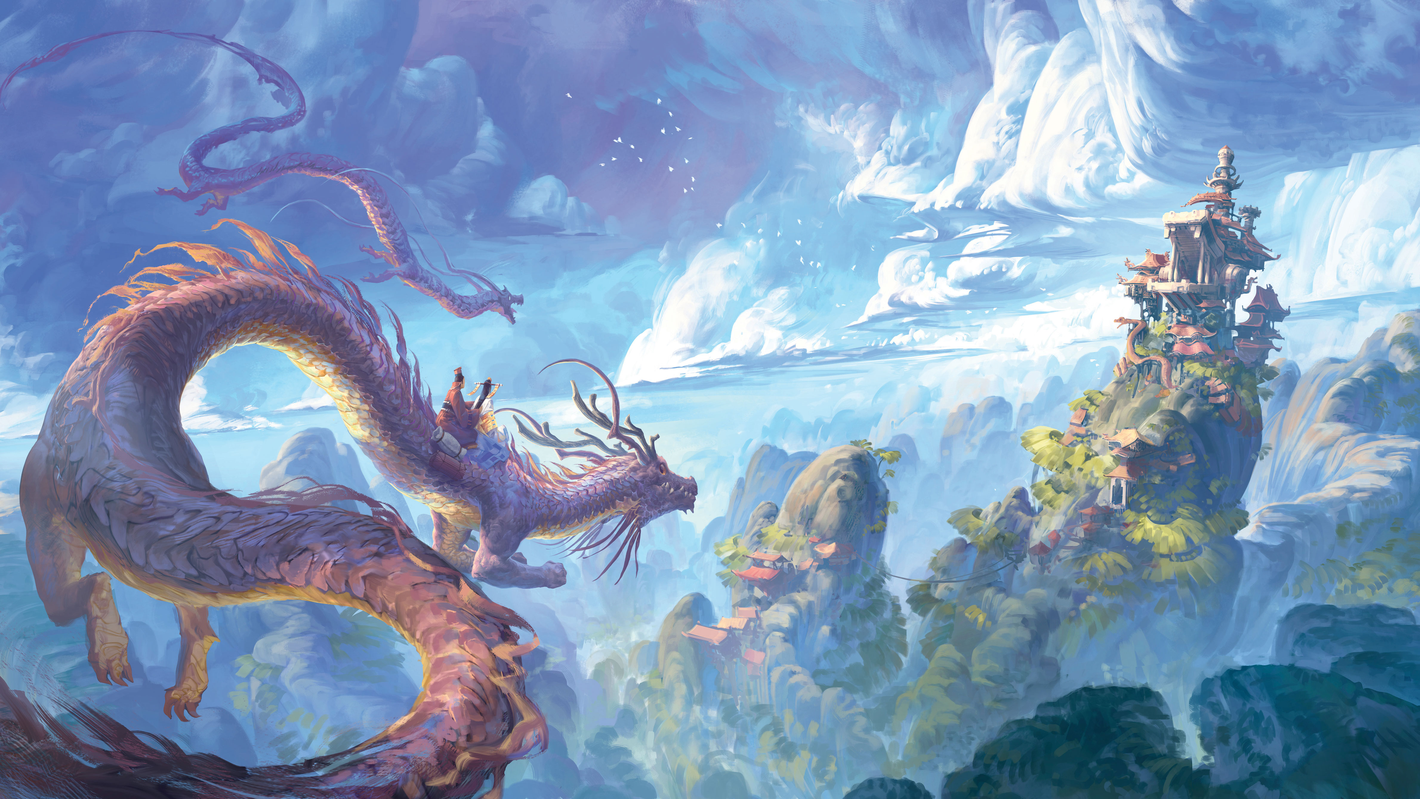
The finished painting contains two dragons
Adding the second dragon completes the composition by creating a pleasing triangle of interest with the larger dragon and the buildings. It also reinforces the direction in which the dragons are heading, helping to convey the distance between the three objects.
This article originally appeared in ImagineFX 163. Buy issue 163 or subscribe here.
Read more:
Click the links below to download your workshop and Q&A assets from Comic Artist Volume 6, including videos, layered files, brushes and WIPs. All of our videos are also here.
Plan a superhero coverÂ
Pencil and ink a game characterÂ
Create a comic page in Clip Studio PaintÂ
Give Tintin the Fables treatmentÂ
Paint Hellboy caricature artÂ
Bring colour to Black PantherÂ
Ink and colour a comic coverÂ
Create dynamic charactersÂ
Use insect designs in your sci-fi artÂ
Add movement to an imageÂ
Improve your design skillsÂ
Comic page layoutsÂ
Comic face varietyÂ
Use classic comic coloursÂ
Show a comic character's body languageÂ
Any Android owners who feel a sense of competition with their iPad-wielding counterparts may be slightly irked that SketchBook 4.0 is only appearing on their platform months after it launched on iOS. But set any irritation aside, and you’ll discover a compelling update with features artists looking for Android apps will appreciate.
Chief among these is a revamped user interface that stays out of your way as you work. It vanishes if your brushstrokes veers near one of its tool panels, and many interface elements are reduced in scale. This makes some controls, like the drawers for adjusting Brush size and Opacity, a little fiddly to access, however. Tap near the centre-bottom of the screen, meanwhile, and a menu with shortcuts appears.
When you first install SketchBook, it’s the Free edition, with limited functionality but no time limit on how long you can use it. To unlock the full toolset, you have two options: you can either spend £4.09 on the Pro Tools in-app purchase, which gives you the tools only within the Android app; or get an annual SketchBook subscription (£4.09 a month or £24.99 a year). The subscription must be renewed each year, unlike the in-app purchase, but you get access to the full tools on the versions of SketchBook for Windows, Mac and iOS as well as Android.
Shibuya Race was created by artist Ryohei Yamashita using SketchBook
Bear in mind that the desktop computer editions don’t offer the one-off purchase option, only the subscription, so if you plan to use SketchBook on either Windows or Mac as well as Android, you may as well forget the in-app purchase and commit to the subscription instead.
With all these complicated buying options, it’s worth mentioning first that the Android app smoothly recognises your subscription when you first log in on the app; and second that once you’ve logged in, the app keeps all the Pro Tools active even if your tablet isn’t connected to the internet.
The main differences your upgrade awards are customisable canvas sizes; dozens more brushes, including a Inking brush with a pleasing line quality; a limit to the number of layers dictated by your device’s memory rather than the Free version’s miserly three layers; the ability to make selections and masks; and unlimited Undos. You also get access to more drawing tools, including rulers and fills.
SketchBook's user interface is much improved
We also like the Predictive Stroke mode, which tidies up your line after you draw it. It’s a real boon for digital inkers, and you can adjust the extent to which your lines will be altered.
This release brings SketchBook for Android up to speed with other versions and maintains the software’s reputation as a quality, unobtrusive drawing tool. Perhaps more importantly for patient Android owners, the under-the-bonnet changes should see more contemporaneous updates across all SketchBook versions in the future.
This article was originally published in ImagineFX issue 158, the world's best-selling magazine for digital artists. Subscribe now.
The art style of first-person survival video game Long Dark can be deceptively difficult to capture. The style from the video game can end up looking either too realistic or too whimsical. We want the player to feel like they’ve stepped into a world that feels familiar but also unique – a world both beautiful and dangerous.
In this Photoshop tutorial, I’ll walk you through my process of capturing the style of the Quiet Apocalypse.
From the early days of the game we wanted the art style to come across as painterly. The art style has been achieved in a collaborative process by the concept artists, the 3D artists, and the tech artists at Hinterland.
I can sum up the basics this way: broad areas of subtle texture encased in sharp and simple silhouettes.
I’ll take you through my process, where we’ll use the shapes that we achieve in the sketch as the basis for the final silhouettes. Using simple composition guides to ensure the overall image is balanced, we’ll give the image a painterly look using texture brushes and bold brush strokes. We can retain those strong silhouettes and bold shapes with one of my favourite secret weapons: Photoshop’s Lasso tool.
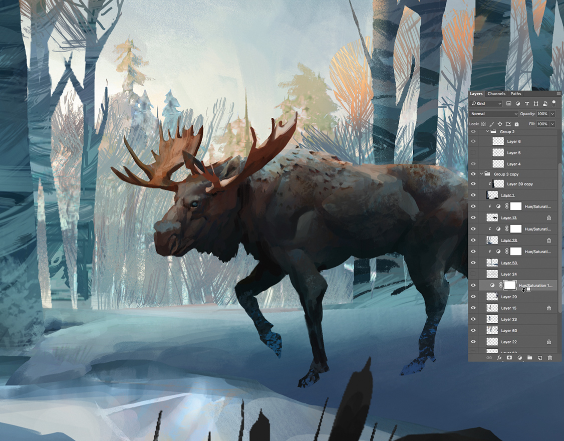
We’re adding another wild animal, the moose, to the list of adversaries that you may encounter in the game. And we’ll focus the illustration around this giant of the forest.
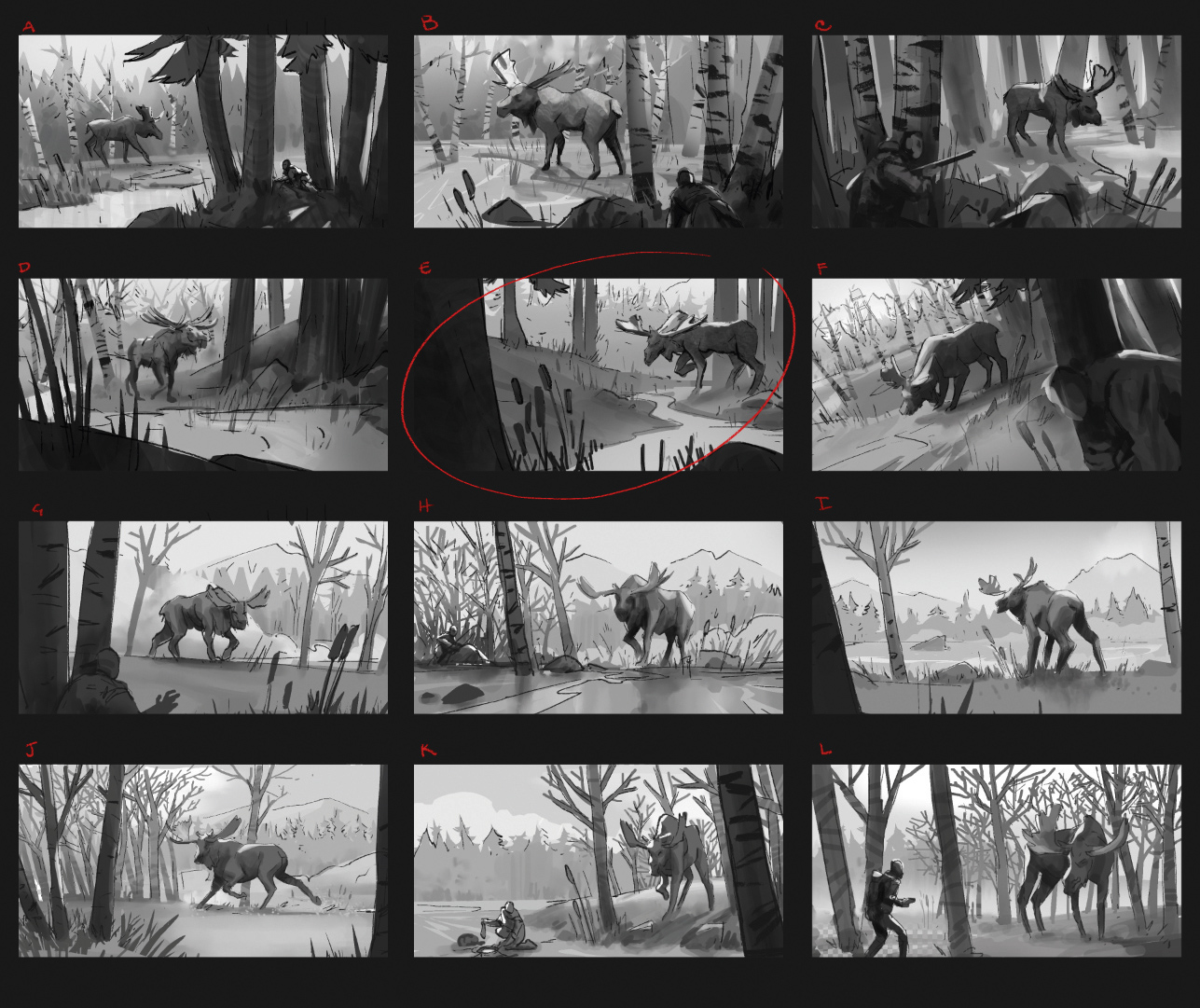
Creating thumbnails with composition options aids the artist and the client
The task was to have the moose by water, near birch trees, and featuring cattails prominently, which they eat. There are many number of ways for staging these elements. I came up with 12 thumbnails to give myself options and generate ideas. I came up with both first- and third-person options, for the creative director and art director to look over.
Next stage is to refine the chosen thumbnail
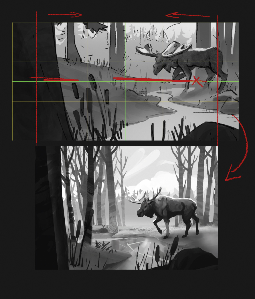
The chosen thumbnail shows strong fore and background elements, and a good sense of scale for the moose. I refine it, using a composition guide that identifies the centre of the image, and the Rule of Thirds.
However, the horizon line is at the centre of the frame, left and right are equally weighted, and the lower left cattails are distracting. So I lower the horizon to the bottom third, adjust the staging of the moose, and add the birch trees.
Pro secret: Composition checks
Use tools to figure out the centre and Rule of Thirds. These can help you stage a pleasant composition, and avoid silly and amateur mistakes, such as putting the horizon at the middle point of the frame.
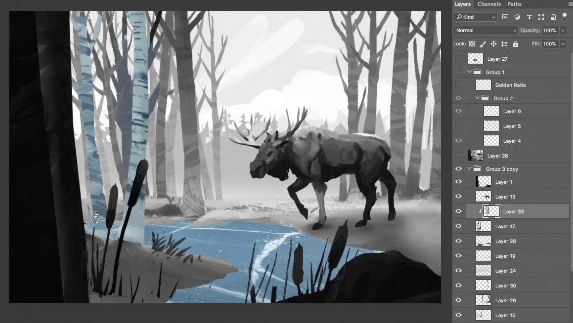
Spend some time developing the composition
I spend time developing a well-composed sketch in Photoshop, and split it into the layers. This will help me use the sketch shapes in the final painting.
I also take some high-resolution screen grabs from the game and use these screenshots as reference, to both keep the work in the style of The Long Dark and as a base for texture. I use the shapes of the sketch as a clipping mask (right-click>Clipping Mask) for the brush strokes and textures.
Free Transform and Warp will help you get the concept just right
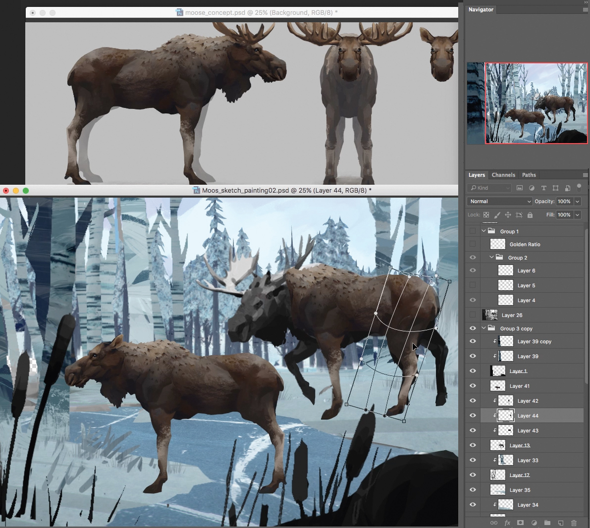
I continue to use the established shapes of the sketch as a clipping mask, starting with the moose. I concepted the original moose design for the game, so I use the established concept to help block in the shape of the animal.
I use the Free Transform and Warp tools (Cmd+T, right-click>Warp) as necessary to get it looking mostly correct, and paint over any leftover problems.
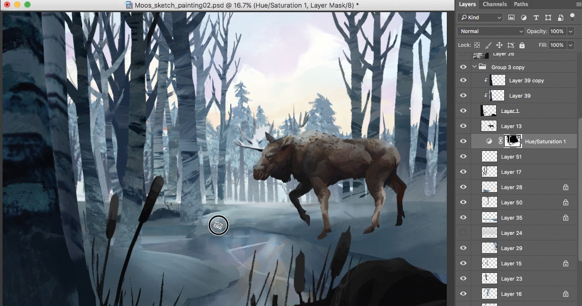
Lift the focal point from the background
I use a Hue and Saturation layer to darken the foreground and the trees to help frame the head of the moose. I then use the clipping mask again and duplicate the Hue and Saturation layer a number of times. Making sure I keep my bigger shape layers separated, I clip them above each individual layer before I flatten them. Then I start painting branches with my brushes.
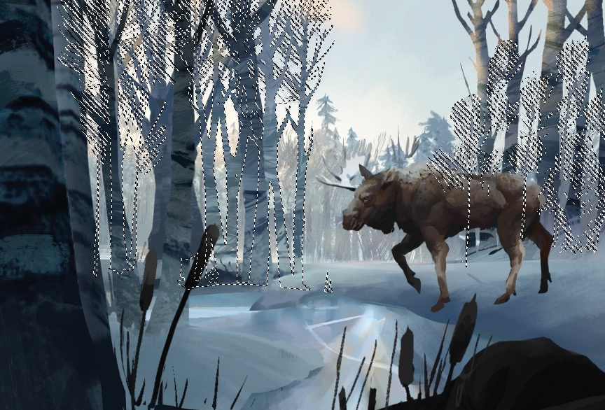
Next, create a selection mask
Another way I mask where I’m painting is by using my layers to create selections. I’ve painted in more branches and trees at this point. Now I want to start adding some light hitting the top of the trees. I create a selection mask (Cmd+Shift+click layers).
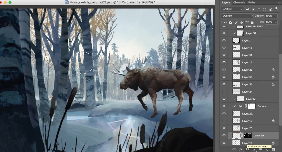
Getting the lighting right is crucial at this stage
I then take the selection mask I made in the last step and turn it into a vector mask. I set the layer to Overlay and start adding some warmth of the setting sun to the top of the trees. With an idea for the palette, I spend a good amount of time getting reference and observing how the sun hits the top of the trees at sunset.
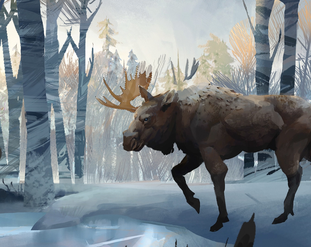
The lasso tool is an underrated ally
Now that I have an idea for the lighting, I turn my attention to the moose. I love using the Selection tool (L) to create strong shapes that I can fill with bold brush strokes. I trace over the sketch of the antlers with the Lasso tool, and use bold and long brush strokes to hint at a subtle texture of the antlers.
Pro secret: Lasso is my secret weapon
The Lasso Selection tool is one of my favourite Photoshop tools. I use it to draw shapes, and to combine organic round forms with sharp straight ones. Some shortcuts to keep in mind: L (Lasso tool); L+Cmd+lift stylus off tablet (get point-to-point straight lines); L+Shift (add to selection); and L+Alt (subtract from selection).

Start painting in some texture
Once I’ve blocked in the antlers, I lock the transparency on the moose layer (click the checkered box at the top of the layer window). I now start defining the form of the antlers, and using textured brushes to give the image that subtle painting texture reminiscent of The Long Dark. I also have lots of reference of moose antlers to really understand their shape and how they catch light.
It's time to dip into Hue and Saturation
I realise that the image is quite muted. The colours need to be bolder, so I use a Hue and Saturation layer. I increase the Saturation slightly and adjust the Hue, too.
I then repeat the process in step 5. I duplicate the Hue and Saturation layer, making sure I keep my bigger shape layers separated. Finally, I clip the Hue and Saturation layers above each individual layer before flattening them.
The sun's warm glow is added here
I start adding the warm glow of the sun poking through the trees on the left side of the image, using a Color Dodge layer. I put it behind some of the background tree layer, but not other trees in the foreground. I then add another Color Dodge layer and put it behind all of the trees to get that blown-out look of the sun.

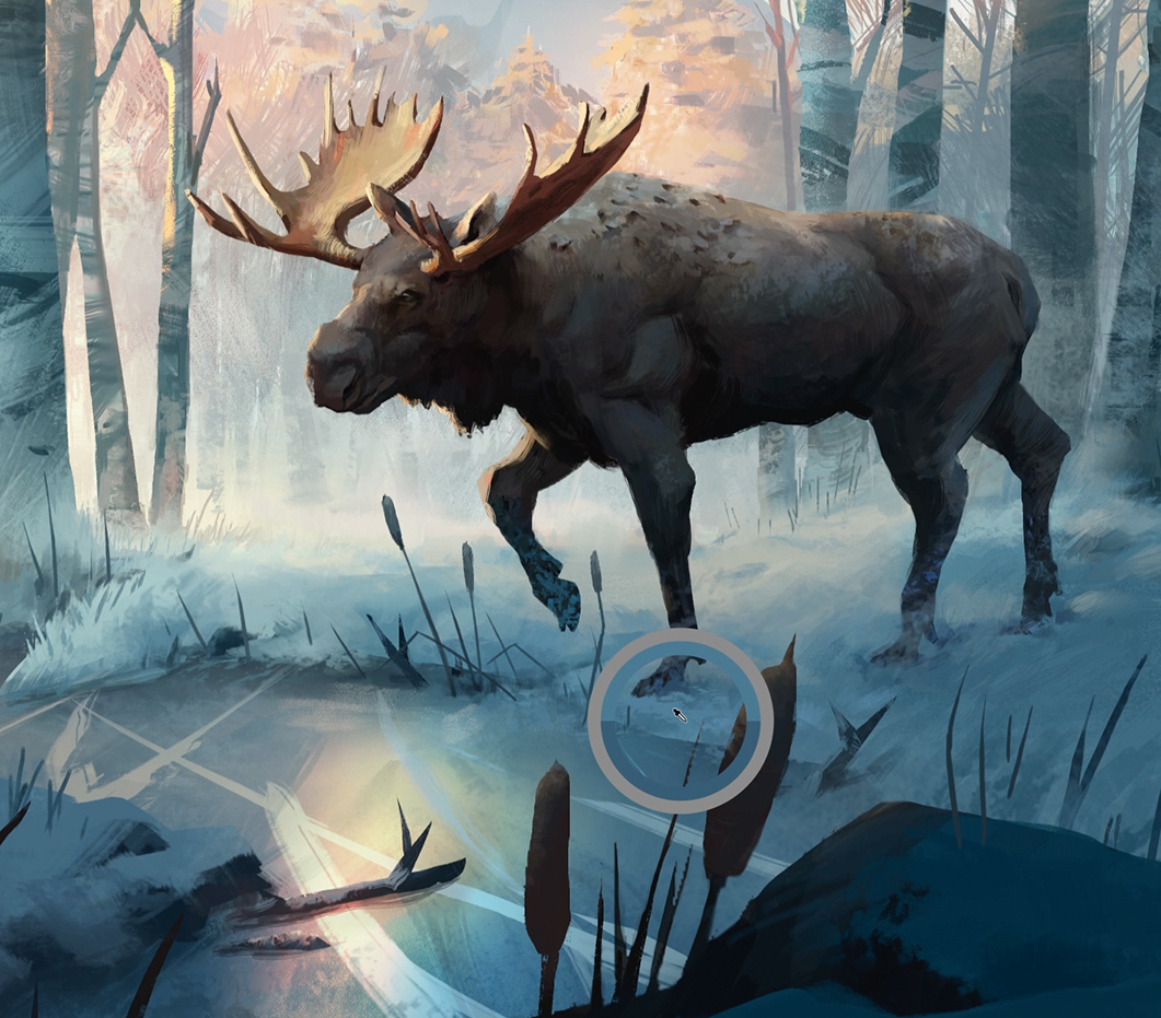
Making adjustments to the focal point will ensure it draws the eye
I start working in the area around the focal point of the painting, which is the head of the moose. I make sure that the beast’s eye looks correct. I also notice that the sky above the moose is introducing too much contrast to the area above the head. My solution is to block in a mountain with a simple Round brush.
Pro secret: Practise with your brushes
Texture Photoshop brushes can appear to be the secret sauce that makes a good painting. They are not. Like any tool, they require practice. I have two brushes that I use all the time. I like practising with them by doing studies of film stills, the work of Old Masters or photo studies. Without the need to invent the subject, it enables me to focus on technique.
Start adding detail, but remember to stop!
I receive some feedback to exaggerate the size of the antlers, so I increase their size. And them, being mindful not to doodle too much, I start adding details to the scene. If I use texture brushes then I make sure to let the texture do the heavy lifting. This may take several strokes to get right so I Cmd+Z a fair bit until I get the one brush stroke that’s perfect.
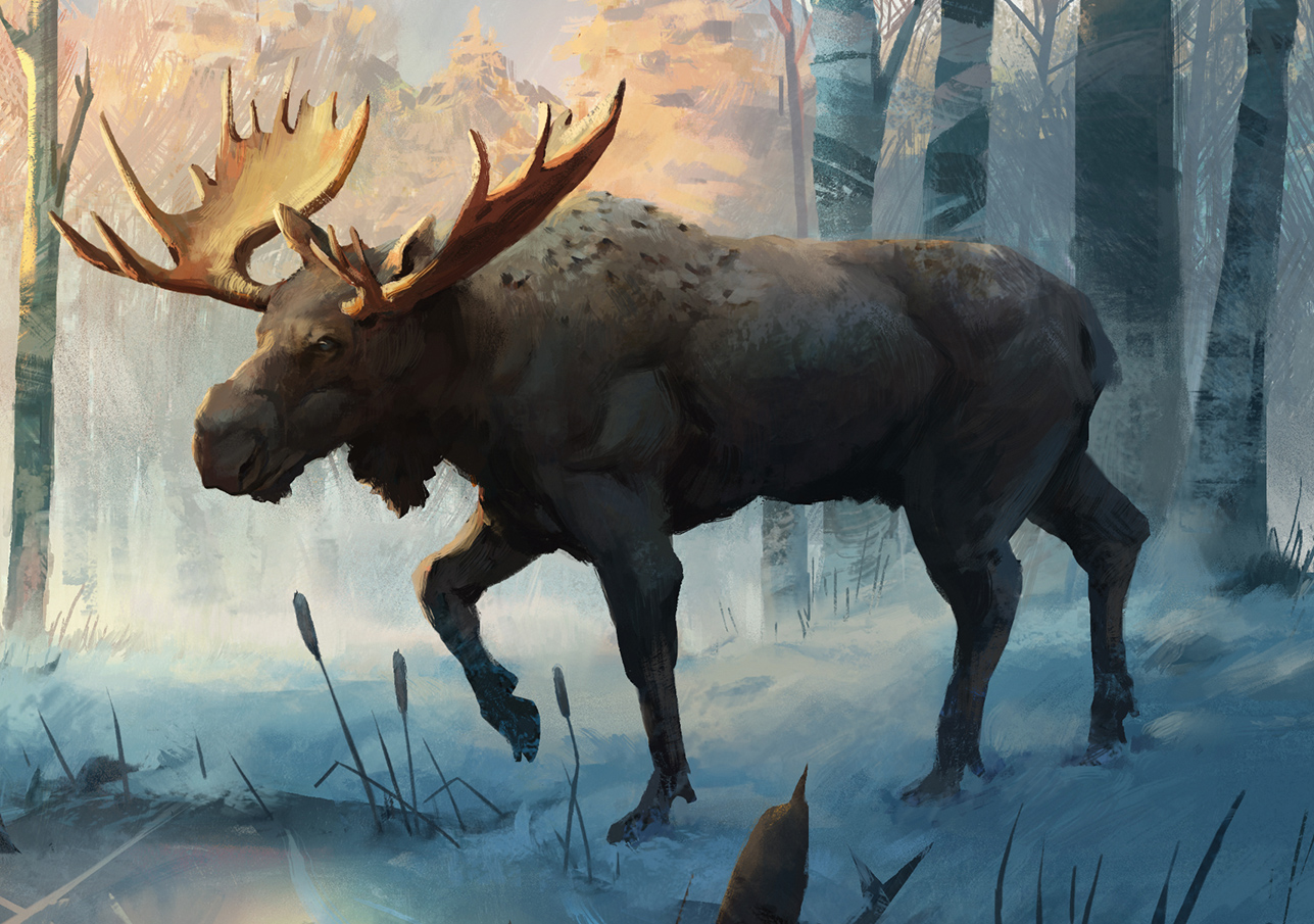
An oft-overlooked stage – step away, then return to your work afresh
I spend some time away from the painting to see it with a fresh perspective and realise that further details are needed on the moose as the focal point. I also spend time loosening edges with painterly brush work, keeping in mind the style of The Long Dark the entire time. I then send the work to the creative director and art director to get the art approved. Once approved, the painting is complete!
This article was originally published in ImagineFX magazine issue 157. Buy it here.
Related articles:
Looking for the best new monitor for your creative work? Here, we review the BenQ PD2710QC…
High-quality IPS LCD panel? Check. Generous 27-inch proportions? All present and accounted for. Expansive 2560 x 1440 native resolution? Affirmative. One hundred per cent sRGB colour space support? You've got it.
From the get-go, then, BenQ’s PD2710QC is an appealing LCD panel packed with features to please graphics professionals. But then there are plenty of other similarly equipped monitors to choose from. Happily, however, the PD2710QC has one or two additional tricks up its sleek, minimalist sleeves.
For starters, it packs a USB Type-C dock with full support for DisplayPort alternate mode plus charging. The upshot, importantly, is that you can connect this monitor to a laptop computer via a single USB Type-C cable and both drive the screen at full native resolution and charge the laptop at the same time. You can also connect and use peripherals via the monitor’s multi-port USB hub.
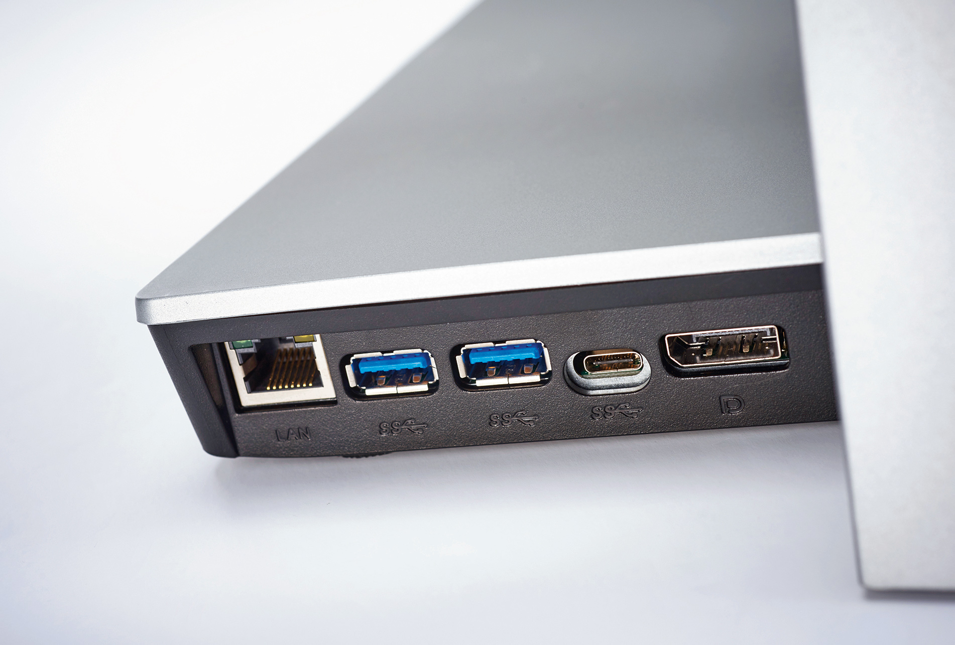
The display base of the BenQ PD2710QC includes a USB hub, video out and even an option for ethernet network connectivity
USB Type-C is popping up on all manner of portable computers. But the PD2710QC’s capabilities will be of particular appeal to owners of Apple’s 12-inch MacBook. That laptop has a single USB Type-C port for everything: video out, charging, attaching peripherals, the works. So the PD2710QC’s solves all your MacBook connectivity problems in one fell swoop.
As for anyone who isn’t planning to make use of the fancy new USB Type-C interface, the PD2710QC also sports a pair of conventional DisplayPort sockets, a Mini DisplayPort input and an HDMI port.
It’s also a very simple screen to set up thanks to the full range of tilt, height, rotate and swivel adjustments, and a particularly user-friendly on-screen menu.
It’s no slouch in the looks department, thanks to a slim-bezel minimalist design and high-quality construction.
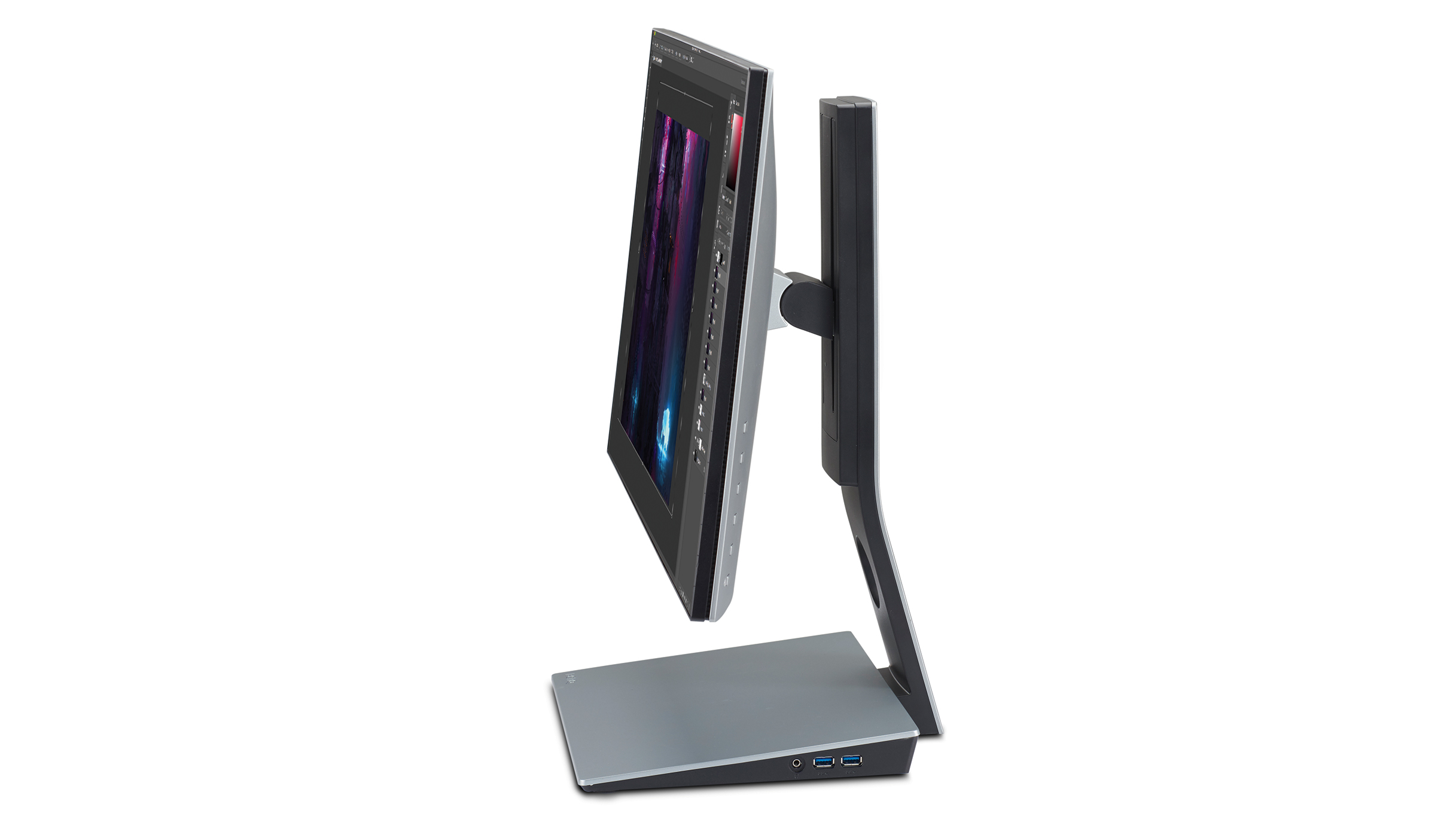
BenQ’s latest LCD monitor boasts a slick, slim-bezel design with a base unit that incorporates a range of inputs
All of which just leaves the not-so-minor matter of image quality. Out of the box and without any calibration, the BenQ PD2710QC is distinctly usable, with nearly perfect contrast, little to no evidence of colour compression together with all the usual benefits of an IPS panel, which include superb viewing angles, decent response and vibrant colours.
It’s even better after calibration and achieves low deltas to target values in terms of gamma, colour space and colour temperature. All of which means the PD2710QC makes for an extremely appealing overall LCD panel package.
The downsides are two-fold. First, this isn’t a truly high-end professional display. Its colours are eight-bit per channel, not 10-bit per channel, and it doesn’t fully support the latest super-sized colour spaces. And yet it’s a serious financial investment, even if that’s broadly in line with similar semi professional-grade monitors.
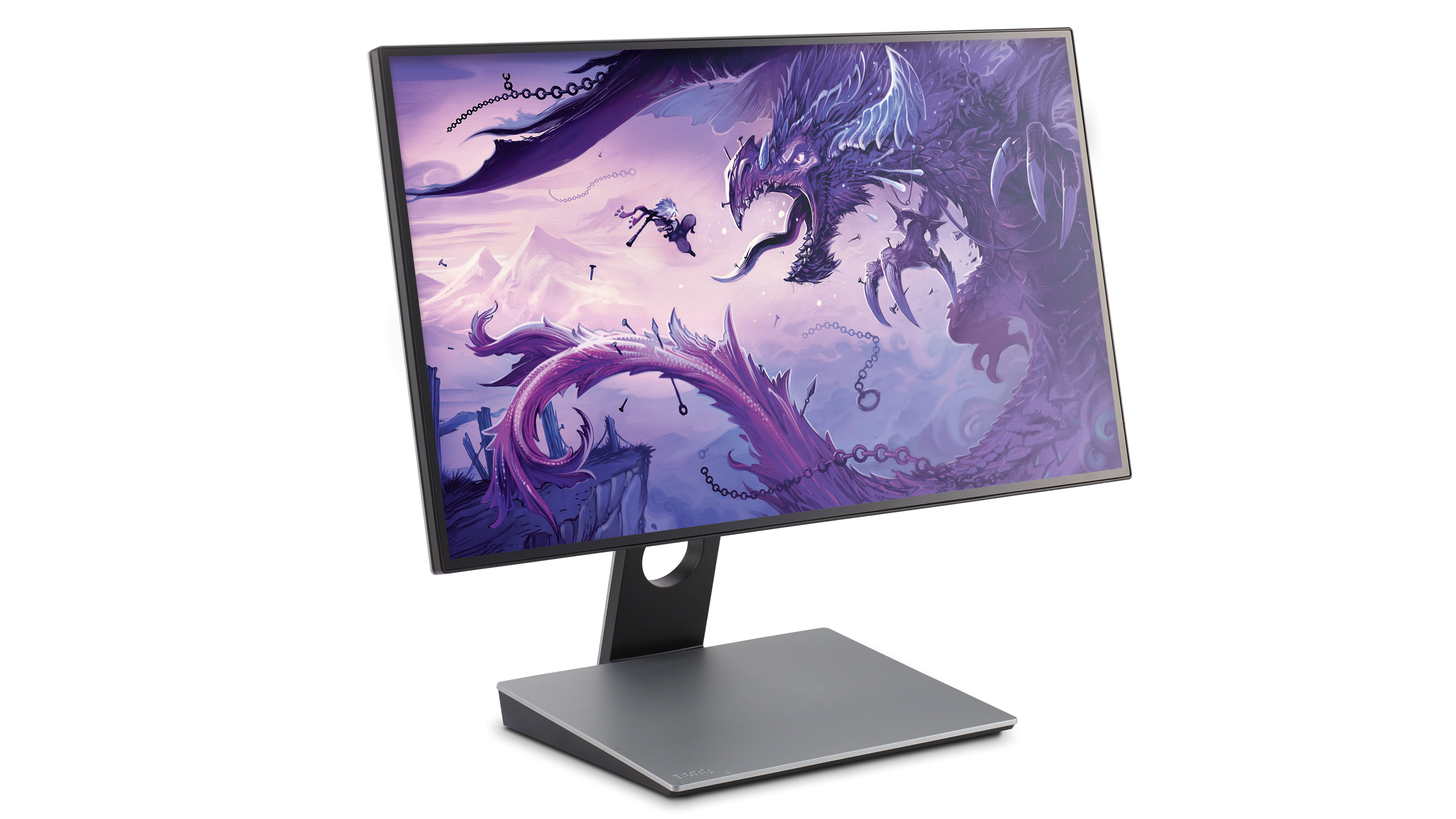
The 27-inch screen comes with an anti-glare, matte finish that helps to reduce distracting reflections
For sure, you can get more screen inches and pixels to work with for the same money if you’re willing to give up further colour accuracy. But if you’re after a production-quality display with top-notch connectivity, the new BenQ PD2710QC is well worth a look.
This article was originally published in issue 157 of ImagineFX, the world's best-selling magazine for digital artists. Buy issue 157 or subscribe to ImagineFX.